Monday, June 29, 2009

Boskone 47 Mini Poster

Man, the NESFAns are like clockwork with their newsletters. The latest one includes this cool little full-color flyer pimping next year's Boskone 47 in February. They used my cover illustration for George Zebrowski's MACROLIFE and I couldn't help but smile when I saw it. Whomever is responsible for designing this flyer -- great job! :) I dig it and I'll hang up mine here in my studio. You can download your very own right here.

Thursday, June 25, 2009

ALWAYS FOREVER is here!

Crazy good news for Mark Chadbourn's AGE OF MISRULE: BOOK 3 -- ALWAYS FOREVER! The book has sold out its first printing before it even hits the stores! Here's what that means -- bookstores liked what they saw from the first two books in the trilogy and they have confidence this third book is a solid bet to sell equally well, if not better. So they upped their orders and effectively bought up the entire first printing. What that means to you is this: if you want a first-edition copy of ALWAYS FOREVER, they should be at your local bookstore right now and it's best to buy soon because the distributors don't have any more in their warehouses. :)

My comp copies of Mark Chadbourn's ALWAYS FOREVER arrived the other day and the printing turned out great! I illustrated the cover for this one, as well as the previous two books in the series, WORLD'S END and DARKEST HOUR. It's fun to see the three books lined up, side by side.

Meantime, I'll soon be back to working on the covers for the next books in this story arc. Congrats to Mark and to Pyr!

Thursday, June 18, 2009

2009 Chesley Award Noms!

Received fabulous news late yesterday! I'm nominated for four 2009 Chesley Awards. Wow!! Here's the complete list of nominees. And boy, what a list it is -- there will be some heavyweight decisions in several categories. Here are my four nominated works:


(Above)
Best Cover Illustration: Hardcover
VIEWPOINTS CRITICAL: SELECTED STORIES
Author: L.E. Modesitt, Jr.
Publisher: Tor


(Above)
Best Cover Illustration: Paperback
FAST FORWARD 2
Edited by: Lou Anders
Publisher: Pyr


(Above)
Best Cover Illustration: Magazine
ASIMOV'S
September 2008


(Above)
Best Interior Illustration
ELRIC: THE STEALER OF SOULS
Author: Michael Moorcock
Publisher: Del Rey
(This selection is one of 20+ interior illustrations I did for the book, but I'd have to say this is my personal favorite. Here's an extensive gallery of some my other interiors from the book.)

And finally, shoutouts to Lou Anders -- a 2009 Hugo Award nominee for Best Editor, and a 2009 Chesley Award nominee for Best Art Director (a very rare feat) -- and also fellow Texan Vincent Villafranca for his well-earned 3D nomination. Congrats to all fellow nominees. I'm proud and honored to be amongst you!

Wednesday, June 17, 2009

My Interview with China's FANTASY ART


Yesterday, you saw the May 2009 cover of China's FANTASY ART Magazine. This morning, I received a PDF of my interview pages inside the mag. Above are four of the feature's eight pages. FANTASY ART says it'll be about three months before I see a physical copy of the mag. That's a mighty slow boat, but I'm sure it'll be worth the wait. Too bad I can't read Chinese, but the spreads are so beautifully done that they're still a pleasure. Huge thanks to Lizzy Carft and all at FANTASY ART for making this possible. :)

Tuesday, June 16, 2009

Wow! On the cover of FANTASY ART in China!

My illustration for Michael Moorcock's ELRIC: THE STEALER OF SOULS is featured on the May 2009 cover of China's FANTASY ART Magazine, the country's leading pro magazine celebrating fantasy art and design. Earlier this year, Lizzy Carft conducted an interview with me, which is reportedly inside this issue. I say "reportedly" because I've yet to see the actual magazine itself. I'm sure the good people of FANTASY ART will be sending a few to me and I can't wait to see how it looks. When they do, I'll likely need the mighty Xin to translate the read. :) Very cool!

The Little Antho That Could

Seems like FAST FORWARD 2 is the critical darling that just won't die, well over a year after initial release! :) Here's two more extensive reviews courtesy of SFSite (reviewed by Derek Johnson) and Fantasy Book Critic (reviewed by Fabio Fernandes). Happy to see this, as it's always been tough for anthologies to survive, even at the best of times. I've said this before, but I'm extremely proud to have illustrated this cover because books this good don't grow on trees, to say the least. If you love great sf, and wish to see anthos like FF2 continue, please consider buying one, if you haven't already. Your purchase doesn't affect me one way or the other. I certainly don't make any money from the sale, but literature is best when it's diverse. The sf field needs books like FF2 just as it needs its ubiquitous best-sellers.

Sunday, June 14, 2009

What If? Jeff Ford & John Picacio Book?

No secret that Jeff Ford is one of my favorite authors. I've done covers for several of his books, including the wraparound cover art for THE EMPIRE OF ICE CREAM (pictured above). For years, we've talked about collaborating on a lush, illustrated book of his much-loved, Fountain Award-winning story "The Annals of Eelin-Ok". I'd love to illustrate this story, but so far, it's proved impossible to shoehorn a major project like that, on-spec, into my busy cover art schedule.

Well -- check this out: Jeff's story centers around the mythology of the Twilmish, a race of fairies who live in sand castles. Later this month, there will be a festival celebrating the Twilmish in Fairfield, CT. Big deal, right? Well, to the best of Jeff's knowledge, he made this mythology up, completely out of his imagination, and was shocked when he found that he was being invited to a celebration like this. The festival organizers believed his story so whole-heartedly that they were sure he was referencing an existing Celtic mythology. And they've now built a festival around it! Awesome!

So, back to this dream book -- he's a World-Fantasy Award-winning writer who's busy, busy writing, and I'm a World Fantasy Award-winning illustrator who's busy, busy illustrating. We both want to illustrate a beautiful hardcover edition of his story "The Annals of Eelin-Ok." Currently, there's no publisher for this book.

If an entire festival can be inspired from this simple short story, then how successful would an illustrated book be?

Moorcock Q&A at Mallozzi's

Over at Joseph Mallozzi's blog last week, Michael Moorcock answered an extensive battery of questions from Joe's fans, mostly about Elric and ELRIC: THE STEALER OF SOULS). It's fabulous stuff. Joe's blog is terrific because he's so well-read and makes every effort to help others be the same. He's the executive producer of the STARGATE: ATLANTIS series as well as the forthcoming STARGATE UNIVERSE series, and he's a mensch.

Wednesday, June 10, 2009

Picacio Wallpaper at Tor.com!

Free stuff, folks -- courtesy of the good people at Tor.com. They've just posted my artwork for George Alec Effinger's A THOUSAND DEATHS as a wallpaper -- part of their week-long celebration of the Hugo Professional Artist nominees. Go grab it while it's there. Available in several formats for your convenience. And if you haven't voted in the Hugos, what are you waiting for? :) Worldcon supporting memberships are only $50 and not only give you the right to vote in the Hugos, but you receive the Hugo Voter Packet, a ton of free Hugo-nominated reading and art. Memberships available here, and here's the Hugo online ballot. Voting deadline is July 3rd.

Monday, June 08, 2009

'SALEM'S LOT

Here's my new illustration for Stephen King's 'SALEM'S LOT. It'll be featured in the forthcoming massive art book KNOWING DARKNESS: ARTISTS INSPIRED BY STEPHEN KING. 'SALEM'S LOT is one of the seminal vampire novels of the modern era, and a book this famous comes "pre-loaded" in the audience's imagination with a lot of vampire visual tropes. I wanted to avoid those because we've seen them enough. It seems to me the book is much more than just a vampire novel. So no fangs or blood spatters here. Instead, my picture is simply about a house and a small, mundane town.

As for the book itself, it's gonna be an amazing volume. Contributing artists include Michael Whelan, Bob Eggleton, Bernie Wrightson, Don Maitz, Les Edwards, Drew Struzan, David Ho, Douglas Smith, and a ton of others. Essentially, this will contain the vast majority of King book cover art ever produced, as well as new works created especially for this edition. Centipede Press is the publisher, and if you remember the jaw-dropping LOVECRAFT art book they released last year, then you know the production values are gonna be gorgeous for this book. They're taking pre-orders right now. It's a limited edition, so definitely check it out! :)

Saturday, June 06, 2009

Three

Whoa. Just realized my blog is three years old today! Launched 6/6/06. Where did the time go?

Friday, June 05, 2009

The Art of Michael Moorcock's ELRIC

(Top left: Art by Michael Whelan / Top right: Art by P. Craig Russell / Bottom left: Art by Kent Williams / Bottom right: Art by Walt Simonson)

Sounds cool, doesn't it? Is this a lush, hardcover art book that you're missing? No, it's not missing. It doesn't exist. As far as I know, no publisher has seriously approached Mike Moorcock about it. But wouldn't it be an amazing art book if it did? Think about the greats that have illustrated Elric over the years.... Michael Whelan, Yoshitaka Amano, Brom, Walt Simonson, P. Craig Russell, and Robert Gould, just to name a few of the legions of artists in Elric art history. And speaking of legions, think about the armies of Moorcock fans worldwide. What Moorcock fan wouldn't covet a book like this? Heck, what fantasy art fan wouldn't? Sounds to me like a smash hit waiting to happen. :)

Wednesday, June 03, 2009

Dave Nalle Talks Valdemar & AGE OF MISRULE!

The cover of AGE OF MISRULE: BOOK ONE -- WORLD'S END recently received love from no less than font god Dave Nalle, owner of one of the coolest font sites anywhere, The Scriptorium. He designed the font Valdemar which is used in the cover's type design. He gave a shoutout to designer Nicole Sommer-Lecht, and offered the following:

"The overall result is excellent, and it’s just the kind of book Valdemar was designed for. I also quite like the cover art by John Picacio, which is surprisingly conceptually reminiscent of the cover Howard David Johnson did for my Ysgarth RPG. Special kudos also go to Lou Anders of Pyr for putting such a good design team together."

I've never heard of Howard David Johnson or seen the Ysgarth RPG, but thought that was strange and amazing. Dave's full text even offers an impromptu review of the book to boot! After seeing this, I emailed him and asked if we could do a mini-interview. He graciously accepted.

What inspired the creation of the Valdemar font?

Dave: I was actually on vacation with my family in England when I started working on it in 2000. There was a hand-lettered title on the cover of a horror-themed puzzle book which I bought for my daughter and after looking at it for several days I gave in to a compulsion to design a font which would be a better title font for a book like that. Because my computer access was limited while traveling I drew the characters by hand, starting with a set of rough-looking serif characters and then adding somewhat ominous, magical elements to create alternate versions of each character. The font ended up being very successful and was picked as the signature font for the Harry Potter merchandising campaign so it appeared all over the place on packaging for action figures and toys. The result was that it became overexposed, so a few years later I designed Valdemar Alternate so that there would be more variant characters, giving designers more options and giving the font a longer shelf-life.

What are some of the decisions you face when designing a font like this? Any surprises in the making of this one?

Dave: The challenge on Valdemar was coming up with elements to add to the basic characters which looked mystical and yet were visually appealing. Most of them worked, but I really hate the "L" in the Valdemar Alternate character set with the short, rather weak looking spike going through it. But the biggest challenge was to come up with enough little quirks for 26 and ultimately 52 characters while not duplicating ideas I'd used in a couple of past conceptually similar fonts like Necromantic and Ironworks. The main surprise is how popular Valdemar has been. There are other fonts I've put enormously more work and thought into which haven't been anywhere near as popular. When I made it I was just kind of playing around, but clearly the idea resonated with people.

You've designed some amazing fonts. At this moment, what are three of your all-time faves you've designed?


Dave: I like Hadrianus because although it's derived from Roman inscriptory lettering, it's still basically an original design and it's the first traditional text font I did which works really well. Earlier text fonts I designed were either too derivative of other fonts or awkward looking, but Hadrianus works. I rather like Newgrange because I took the basic elements of Celtic calligraphy and took them to an interesting extreme and I think the result is very effective. Another favorite is Orpheus, because like a lot of my fonts it came from looking at someone else's work -- in this case the overly popular Morpheus font -- and deciding that I could do the same concept and make it better. With Orpheus it really worked. Now we just need the world to realize that they should be using it.

Much appreciated, Dave! Thanks for the time. Long live Scriptorium!

Twitter's Working. For Now.

Looks like I have a face at Twitter now. Been tweeting a bit in the last 12 hours or so, and seems to be running smoothly. Let's hope it stays that way. :)

Tuesday, June 02, 2009

Twitter = Big Fail

So far at least. After much ballyhooing from friends, I joined Twitter yesterday. Bad move. For months I've heard "Twitter will change your life" and "humankind will never again be able to function without Twitter" (although I seemed to be just fine without it). So I join, and find that the system has such massive dysfunction that it can't even upload a tiny avatar picture properly. And apparently, Twitter's been having this ongoing problem for at least three consecutive months, and still can't get a grip. I'd normally blame myself and assume user error, but when I click the empty avatar box that has a question mark in it, I see my photo so I know it's in the system. It's Twitter's problem, not mine.

To add to the fun, I'm getting emails from friends saying that they know I'm on Twitter, but can't find me. And on top of that, after the initial photo upload failed and I couldn't get back into my page, I redid my password and created a new one, just to be sure. So now my account oscillates between recognizing and not recognizing two different passwords. Yeah -- Twitter sux in a big way.

If anyone knows an avatar fix, gimme a holler.

Monday, June 01, 2009

Don't Get Me Started

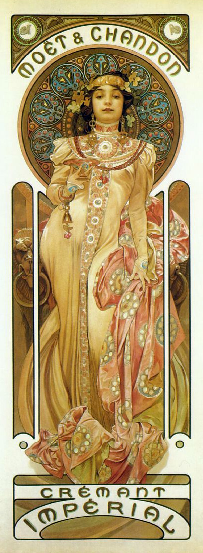
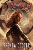
(left, art by Alphonse Mucha, 1905)

I'll get to Mucha in a moment, but I'd like to say that David Apatoff's Illustration Art blog has been one of my faves the last couple of years. I don't always agree with everything he says, but I respect his views, which are genuine and well-said. His most recent post is about Peter Max. Although I'm not a fan of Max's pop art work, David eloquently makes a point near and dear to my heart about illustration vs. fine art. With apologies to David for the copy/paste, here's what he said:

"Artists and critics always chafe at the restrictions imposed by patrons or censors who interfere with the artist's original concept. In fact, it seems that illustration is held in lower regard than "fine" art mainly because the illustrator's vision is subject to the whim of some client or art director. There is some truth to that criticism, but Peter Max demonstrates how the lack of restrictions can be just as hazardous to the quality of art.

In my view, Peter Max, along with Andy Warhol and Leroy Neiman, are good examples of artists whose work was spoiled and made rotten by excessive freedom. Today's fine art scene offers far more examples of artists whose self-indulgent, decadent work has little relevance or value outside their own cloistered circle. When the world provides resistance to an artist (whether in the form of a tough deadline, or a client's demands, or poverty, or totalitarian censorship) it can have a beneficial effect on the art. As the old proverb says, 'the wind in a man's face makes him wise.'

Artistic freedom can help or hurt art. But if great art can be produced in a prison cell or a concentration camp, it's silly for the fine art community to suggest that it can't also be produced within the constraints of a commercial art studio."


May I offer a "hell yes"? Way to go, David. I couldn't agree more--which brings me back to Alphonse Mucha. The art pictured above is Mucha's response for a 1905 Moet & Chandon champagne advertisement. It's commercial art all the way, but is it any less a piece of imagination, craft, design, and inspired execution at its finest because it was created for an advertisement? And where does it say that a curator or pseudo-intellectual has to validate something that beautiful for it to be considered art for the ages?

Several years ago, I had a heated exchange with a reknowned local 'fine artist' who specialized in ill-conceived installation sculptures. He was staring at a piece of illustration in a gallery and asked my opinion. I gave it to him, and he responded, "The trouble with illustration is that it can never be art in the highest sense because it always answers to someone. True fine art doesn't answer to anyone and therefore will always be a higher calling."

Those were fighting words.

After I reminded him of the numerous city council and political hoops he had to hop through for approvals, and the gallery collectors whose dollars he relentlessly chased, I offered the following gentle morsel: "Just because you masturbate on a wall and fool yourself into believing it's got value doesn't mean you're an artist." Maybe not one of my finer moments, but I'm still proud of that one. I still believe the very best commercial illustrations of a superior talent like Alphonse Mucha doesn't need a curator or nostalgia to validate it.

In the end, let me say as a proud, working professional illustrator, that it's not just the interaction with terrific art directors, or the answering to deadlines, or to problem-solving, or to strife, that can perhaps shape a piece of commercial illustration into something potentially special. ALL of those things are potentially huge, positive factors, but it's always about an artist's singular, skillful human response to a moment and to a context. That response must not only solve a problem and serve a client, but it must be strong enough to withstand the repeated scrutiny of that client's corporate masters and the timeless, infinite scrutiny of a potentially worldwide audience. And if in fact, that artist's response can pass these tests and not only maintain its pure expression, but in fact, be emboldened by these challenges and embrace those challenges to transform into something transcendent.....then which art is really 'the higher calling'?
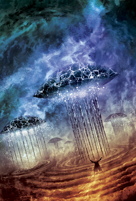
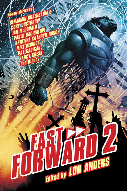
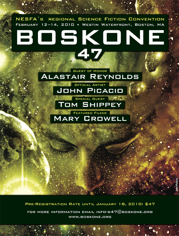